

16 Aug Can Data Win the Heart of a Grant Reviewer? Using Data Visualizations in Grant Proposals By Whitney Gray, MA, GPC
Recently, I conducted a pre-submission peer review on several federal grant proposals from organizations located in rural Kansas. The first question each organization had to respond to was, “Describe your geographical/service area.” Each organization named the counties served in their respective service areas and then went on to describe just how ‘rural’ their area is. While each applicant organization had some aspects of serving rural areas of Kansas in common, they each approached the description differently. Some of the descriptions included the total square mileage contained within their service boundaries; others referenced the state’s definitions that place a county on a continuum of ‘frontier’ to ‘urban’; others pointed out the distance in hours to the nearest major city. Ultimately, each applicant described their geographical service area with the purpose of convincing federal reviewers that Organization XYZ was the only provider of important services for its region.
As I reviewed the proposals, I remembered the time in my life when I lived in Kansas. I am reasonably familiar with rural Kansas, having done some collaborative grant work with organizations on the far western side of the state. I’ve also driven through the state from east to west countless times to visit family in Colorado. So the applicants’ descriptions of their respective rural geography made sense to me. I could visualize and empathize with statements such as, “Our organization is three hours from the nearest major city where similar services are provided.” In rural Kansas, three hours is a long drive, especially in the dead of night or in inclement weather.
But what about the federal reviewers? Would they have the experience of driving through the wide-open spaces of rural Kansas? Would they have a good understanding of a ‘frontier’ county? Would they truly grasp the geographic isolation of the applicant organization and the people it serves?
I’m a firm believer in the idea that a picture is worth a thousand words. When graphics are allowed within the proposal narrative, they can greatly improve the reviewer’s understanding of and empathy with the written arguments.
In the case of the rural Kansas service providers, a visualization of the geographic isolation of the organization’s multi-county service area in relation to the nearest urban centers with similar services would have been highly effective. This particular application had very strict page limits so the graphic would need to be clear and concise. A quick Google search for “interactive Kansas counties map” resulted in exactly what I was looking for – a web-based tool (www.simplemaps.com) that allowed me to quickly and easily highlight specific counties and urban areas. In this example, green areas represent the four-county ‘frontier’ service area of Organization X. The red square indicates the location of the largest ‘rural’ city within the service area. Yellow squares indicate the locations of major ‘semi-urban’ or ‘urban’ cities that would likely provide similar services as Organization X. As a point of reference, the state of Kansas is about 400 miles long.
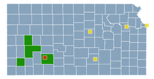
Can you imagine living in one of the green areas and driving through a snowstorm to one of the yellow areas to receive potentially life-saving services? I can tell you – I cringe to think about this scenario.
An effective grant proposal convinces the reader that the applicant organization will effectively create change for the people and communities it serves. Grant makers are looking for a return on investment. Some grant makers are all about the hard data, while others want to learn about the personal stories of lives that have been changed or improvements made in a community because of the applicant organization. Next time you are preparing a grant proposal that is data heavy, stop and try to visualize the data. Ask yourself if you can present the data in a visually appealing way. You may be surprised that an intentionally placed graphic takes up less space against your page and word counts than a lengthy description.
You don’t have to be a graphic designer to create simple, yet effective visuals to support your data. Here are three strategies to try:
- Google it – try searching the internet for a pre-built tool that you can customize. Look for something that gives the option of downloading a free .jpeg or .png file;
- Use SmartArt in PowerPoint – this feature has lots of options to create flow charts, matrices, simple diagrams, and other graphics. Right-click on the graphic and select save as a picture to easily import and scale the graphic into your proposal narrative; and;
- Create a scale in Excel – if you want to represent linear data compared to an average data point (student test scores, for example), the conditional formatting menu enables you to create a temperature scale where red is poor and green is good. This can be copied from Excel and pasted into a Word document as a picture as shown in this example.
![]()
At the end of the day, grant proposal reviewers are people too. As a grant professional, when you can find a way to use data charts and an effective visual, you appeal to the heart and mind of the reviewer, and likely increase your chances of receiving funding.
GPC Competencies and Skills:
Competency 4: Knowledge of how to craft, construct, and submit an effective grant application. Skill 4: Identify and cite accurate and appropriate data sources to support proposal narratives.
Skill 6: Identify proposal-writing approaches, syles, tones, and formats appropriate for proposing organizations and various audiences.
Skill 7: Identify appropriate and accurate uses of visuals to highlight information.
Competency 9: Ability to write a convincing case for funding.
Skill 1: Make a persuasive argument.
Skill 3: Convey ideas clearly.